
Posted on March 1, 2021
How to use a cat’s tongue brush
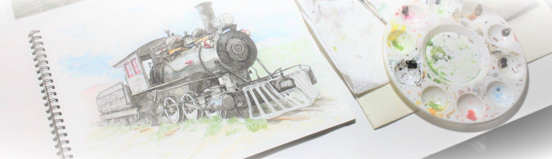
I recently created a short demo on the cat’s tongue brush with watercolor. I hope you enjoy!
Updated on March 1, 2021
Cleaning Out
When is it time to grow up?
I went to University because it was the thing to do. People said you grow up by going away to University. I think that might be a divisive opinion at this point… And I’m not being offensive, politically or economically leaning in saying that. I mean simply that you end up parroting all the opinions of your professors. I’m not sure that’s growing up… it is simply not parroting your parents opinions. You’ve simply adopted new parents. It isn’t thinking for yourself. Not yet.
I went through a liberal arts University and got a broad liberal education. I can remember arguing with my boyfriend about “art for the sake of art”. Art as a conversation and how important that was. Either I won him over or he just started to agree half way through the heated conversation for the sake of peace.
“Art for the sake of art” is when an artist puts a toilet on a pedestal and we all ooh and aah about how profound of a statement that is. The taboo of the toilet brought out into the open. Or once, in a museum, I walked past a piece of plywood leaning up against the wall with a label. Yes, this was and maybe still is considered art.
Don’t get me wrong. I was trained well and can set up a gallery show, draw, sculpt and paint but I also came out of University with an elitist idea of the arts that lasted many of my young adult years.
Twenty years later, I sifted through the old University art text books and ran across this same high brow “art for the sake of art” book. What a load of high brow rubbish? As if one art form is better than another. What my professor didn’t talk about (at all!) was that there are industrial artists and designers working diligently to make a pen have a pleasing look or even that toilet. How is one better than another or more valued? Quite honestly if you place a piece of plywood against a wall isn’t that the absolute height of plagiarism. You didn’t create anything. You just showcased someone else’s work without giving them credit and in so doing claimed a type of elitism over someone else’s craft.
I flipped through the old “art for the sake of art” textbook one last time and threw it into the trash with a resounding thud. A whole lot of blathering talk. Absolute rubbish!
What is art that cannot improve a person’s life, whether through job, hobby or the brighten of a wall, center piece or courtyard, and inspire a dream?
As for the technical and industrial arts… I toured a Technical two year college 2 years ago with my son. I never knew how much fun they had. It was none of the high brow theory but more hands on hard work, creation and skill. I never knew. I left excited and inspired that my son might choose that school! I wish I had!
How often do we parrot with our brains turned off not really understanding the depth and knowledge we are missing out on? One of my professors spent an entire functional sculpture class (the entire semester) teaching us nothing useful. We made a non-functional bowl and a twisted metal tube that blew flower in a persons face.
All the while, another student (who went to a technical school with woodworking before University) worked on sculpted dressers and furniture as an art form. I signed up for the functional sculpture class because I thought I might learn that student’s skill.
Maybe I should have thrown that book in the trash a long time ago…
Posted on July 31, 2025
Watercolor grass
Watercolor grass can be both easy and fun. Here are several simple ways to get started:
Updated on November 18, 2024
Simple Grass
There are many simple ways to make grass.

Example 1: If you have a cat’s tongue brush (also called an oval wash or pointed oval), you can use the brush to both fill in the grassy space and pull down a slim point into a wide base = “grass strokes” leaving a nice grass edge along the top. You can also use that fine tip to pull up fine grass blades where needed.

If you use a slightly dry brush you can use the edge of the brush to swipe and lift up to create fine strands of grass.

Example 2: If you use a large and a small round brush… take the large brush and create an area of grass using plenty of water and pigment.

While that’s still wet take the small brush and pull up blades of grass either with the brush end or with the back end of the brush. The wood will leave darker grooves in the paper while the brush leaves clean strokes so its a matter of the look you’re wanting to creating.

Example 3: If you have some large brushes use them to create a basic grass foundation then let that fully dry. Here I’m using a dagger brush to pull down some grass shapes. The dagger brush leaves very elegant grass blades and is great by itself.

As with any of the grass styles so far, you can use a calligraphy pen to add fine intentional grass blades. Take a large round brush loaded with paint in your nondominant hand. Then use that to swipe across the calligraphy pen to load it as you use it to create your detail.

This method works nearly as well as dipping the nib in an ink well and opens the calligraphy pen up to being a watercolor tool for detailing grass, branches, small saplings or distant trees.

I have created a full video if you’re interested in watching the full demo.
Posted on September 17, 2024
The Beauty of Music
One of my favorite parts of editing video is choosing the music. It creates the mood and flow of the whole piece. I found this one relaxing and both modern and classical. I hope you enjoy!
Updated on December 29, 2023
Simple Layering
Liven up a basic building scene by adding Cadmium Yellow over the areas you want to highlight and Ultramarine Blue in the areas you want to recede

Then start to add your browns in increasingly darker values. Allow the layers to dry in between.


Then layer on a bit of Burnt Umber and Black.

I want the door to recede just like the side of the building so I use a duller tone (not so bright and vibrant): Ultramarine Blue, Black and Raw Umber.

And cool tones in the window for the shadowy interior: Ultramarine and Black.

Oxide of Chromium and Ultramarine Blue for the cool side of the building and then just Oxide of Chromium in various values in the front yard to create variety.


The boardwalk is a wash of Burnt Sienna and Burnt Umber in very light values and patterns and then Burnt Umber and Black to create the finished detailing.

A light wash of yellow green for the sign. Once that’s dry, I penciled in the lettering and then all I had to do is paint slightly to either side to create the effect of negative space around white lettering.


Then a light bit of Ultramarine Blue in the sky with a bit of water to soften in some clouds and the painting is complete.

The full time lapse demo can be seen on my youtube channel:
Updated on August 18, 2023
Painting Faces
To paint a pale skin tone use a thin amount of Cadmium Yellow and Alizarin Red (mixed together) and a good bit of water. With those two paints you can create a neutral peach, light yellow or tan tone or even a pink skin tone (if you lean the mixture a little more toward the red).

First, I put down a pale-mid value…

And then, pull off some of the paint in lighter areas by pressing a paper towel on the paper where needed. This is called “pulling off”. I save myself some time and get two values very quickly.

Let that layer fully dry. Then, I use the same paint mixture of Cadmium Yellow and Alizarin Red to layer another value (basically more paint and a little less water so it’s a bit more pigment)…

Again let that dry. Then, another light layer using the same two paint colors but a little more pink in hue around the temples, eye lids, ears, under the chin and on his mouth.

Then, start adding in shadow tones with a mixture of Cadmium Yellow, Alizarin Red, Cobalt Blue and a bit of Burnt Umber.

His hair is various shades of Yellow Ochre mixed with a touch of Ultramarine blue (to soften the Yellow Ochre a bit into a more neutral sandy color) and then also mix in some Burnt Umber and a bit of Black for variations of lights and darks.

For his glasses, I used 2 values of Permanent Rose mixed with Cobalt Blue and a touch of Black.

His eyes are a mixture of Cobalt Blue and a touch of Black. Then, Black for the pupils.

Burnt Sienna and Black for the eye brows and eye lashes in 2-3 shades (as well as in some of the painting details, like around the nose and mouth).

Finish up on the shirt with a soft mixture of Yellow Ochre and Ultramarine Blue (again just enough to tone the Yellow Ochre down into a soft sandy color). And I’m done.

If I were to summarize: Use very thin coats of color (a lot of water and a small amount of pigment). Let the layers dry in-between. Cadmium Yellow and Alizarin Red are the main colors to mix and layer down. Then, mix in just a bit of a blue to shade the skin tone down (“grey it down”) into a shadow color.
If you’d like to see the full painting demo video its at https://www.youtube.com/watch?v=xbtdaE89Bus
Updated on August 3, 2023
Antique cars
One of the life’s fun moments are when a piece of history drives past. I regularly see old cars and try to photograph them for future reference photos. I’ve now put some of those photos to paper and processed them into videos.
Time lapse watercolor paintings. I hope you enjoy!
Posted on May 25, 2023
Basic Pale Skin Tones
The basic tricks to getting good soft skin hues. Time-lapse (below) and full watercolor painting Demo (release date May 31,2023)…
Enjoy!
Posted on May 18, 2023
Faces Series
Working with Burnt Umber and Burnt Sienna to get beautiful rich skin tones.
Posted on April 14, 2023
Popping on Videos
I use Open Shot Video Editor. This has now happened twice…
Recently, when I was editing video and audio, there was a faint popping or crackling after exporting (NOT before) in the video? This can be extremely frustrating to track down the source.
I check the audio,
Redo the audio in a completely fresh file,
Check the export rate,
And in the end it is the time lapse video itself. When you clip video, that cut can be read as a clicking or popping sound when it is processed. So when you clip a lot of video it results in a slight crackling sound when it is exported. Unfortunately, I had already published the video and hadn’t noticed because of the type of music I’d attached. So how do you prevent this?
Open Shot is a great video platform and completely free. I use a minimum of 2 exports. I process my video time-lapse separate from final takes to minimize glitching and overloading the program. On the first export the video is accelerated x8 minimum and volume reduced to Zero. Then, I open a new project and add the time-lapsed video and work with final audio and music. There continue to be edits and clipping of the video and this is where the popping happens for me. Even though it is the second edit and should have Zero volume mute the video’s volume again to prevent the popping when it is exported for the final take.
Also make sure the rate of export matches the properties of your video each time (for best results, to ensure HD quality, and to prevent clicking as well).
Open Shot is a excellent choice for a free video editor as long as you maximize it’s positives and minimize it’s negative. I’m currently at 40+ videos and have no intention of switching video editors anytime soon!